
eCommerce site UX Appraisal.
As a fresh Graduate, I applied for a position on a grad program with a well known, Irish owned, grocery and food service company. The position title was for a UX and Innovation Graduate, to be employed in a new team in their HQ in Dublin. After applying I went through the standard routines of aptitude, video interview and finally reached the group interview day in the company's office. The group interview day was the usual group discussion on a business topic, a single face-to-face interview, and a pre-prepared presentation, issued to us a week ahead of the interview date.
The challenge for the presentation was to carry out a UX appraisal of their eCommerce site and make recommendations as to how to improve the flaws that we may have found in our appraisal. The presentation was to be 5 slides and around half an hour in length with further time allotted for questions from the people present.
I was issued with credentials in order to be able to log in to the secured system and carry out testing of their full shopping/checkout procedure. I diligently set to work gathering notes and first impressions and exploring the content and parts of the site. Looking back at my notes, 9 months later, my experience was not a pleasant one!
I spent a few days familiarising myself with the site and accompanying Android app, taking notes and deciding what I might need to test with Users for best effect. With only 5 slides available to me in the presentation in order to cover the topics I wanted to hit, I felt I'd best keep it simple. However, as I spent more time with the site and began to develop tasks for Testers to carry out I soon ran into fairly profound stumbling blocks. After receiving my login credentials I immediately went to try out the full features of the site and e-commerce platform. I couldn't do it though. I was unable to log in using the credentials. I couldn't find anywhere to input the details initially and when I did find somewhere it wouldn't work. Feeling very sheepish and a little stupid at not being able to navigate the site I decided I'd better email my contact in HR and just double check the info I had been given.
I received a very prompt reply telling me that yes, the details would work and giving me a link to the right page on the website into which to use them. I thanked my HR contact who proceeded to tell me that she had spent some time trying to find it herself and in the end had to ask someone else. Off to a great start!
Thus the first major black mark against this product was immediately clear. I was dealing with an e-commerce site that was making it hard for people to carry out even it's most basic function. Having now finally gained access to the secured end of the process I was able to develop a very brief survey for Users that would allow me the opportunity to test both task-based and qualitative factors at once.
I created a template of questions to ask my Users and set to with my first volunteer...... It was a complete disaster. My first Tester (User1), someone of quite high web literacy and well accustomed to e-commerce and using various e-commerce platforms, was completely unable to navigate the site, complete any of the tasks I had developed for Testers to carry out as I observed, and I was left with one very annoyed Tester. I scrapped my initial framework and trimmed things down significantly. My initial test with User1 had taken nearly an hour to complete, with me being a silent witness for the majority of the exercise, only asking the odd question or relaying the tasks I wanted User1 to attempt to complete. Fearing an uprising should I attempt the same test on this website with other volunteer Users, I set about testing some very basic elements of the site. I planned out a basic User Journey from arrival at the site, to checkout at the very end, including a few questions about look and feel, as well as questions about some of the content on the homepage. I had hoped that this would reduce the length of each Test to a maximum of 30 mins and provide me with enough information to come to some well grounded recommendations for improvement, backed up with User feedback.
My new framework was basic, a spreadsheet of 5 pages, each containing a question of task, each broken down into 3 likes/dislikes, any User Comments made during testing and my own observations.


Armed with a clipboard, a reliable biro, and a passive yet interested expression, I sat my volunteers down one by one and ran through my testing as quickly as possible. With each User I introduced the website, what I would be doing, what kind of questions I was going to ask, and roughly what the website was and what the primary function of the testing was.
User1
User1 (yes my long suffering original User1), set to the task reiterating much of the same comments about the look and feel of the site. Moving on to the task based questions things once again became unstuck. User1 simply couldn't navigate to the correct log-in portal. I assured them this was valuable feedback and urged them to continue attempting to find the correct log-in. After close to 10 minutes had passed, and with User1 now highly frustrated, I stepped in and showed them where to navigate to the log-in screen. Once passed this step everything went well and User1 completed the remaining task without issue. Feedback on the final Task however was interesting. Task 5 was a simple one, Locate your nearest store. User1 completed this task without issue, finding the store locator and bringing up the page. User1 was not impressed though. The page titled Store Locator was a simple static graphic showing the companies various outlets around the country. User1 felt this was particularly useless as it was vague, lacking in detailed information and did not actually tell you where your nearest store was actually located.
User2
For User2 I, of-course, set the same tasks however I decided to intervene sooner in order to hurry the testing along when it came to finding the log-in screen. After 5 minutes of wandering through pages and links I stepped in to show User2 (an older person, past retirement age, but reasonably digitally savvy with various android devices and a regular internet user). Once log-in was completed successfully User2 had no issues with the final tasks although they felt that the process for both searching and browsing for items was too long-winded and could be streamlined. User2 had no issue completing the final task and found the map of store locations, however they didn't feel as strongly as User1 as regards to integrated mapping and actual location data.
Users 3 to 6
Users 3 to 6 (a 30 something digital savvy professional, a less digitally savvy retiree, and 2 people in their late 20's early 30's who work in the food service industry) broadly corroborated the earlier findings, all needing guidance in order to log-in, all generally disliking the categorisation of marketing content on the homepage, and generally ending the test frustrated and exasperated.
Conclusion
I know this has to be one of the driest and most colourless articles ever committed to a blog on UX. When I started into this project it quickly became an exercise in finding the quickest ways to fix the UX and at least make it functional. There was no scope for walls of sticky notes, fancy diagrams and cartoons of Users. There was me, with my notebook, trying to find the nicest way to break the news to the people I wanted to hire me, that they had built one of the worst e-commerce websites I have ever experienced. To me this was an exercise in damage limitation and how best to quickly turn the site around and make it usable for the public and the customer. Had I been involved in the business I never would have let this site go live but there it was, for all the world and all their customers to see.
I quickly compiled my notes and developed some ideas for solutions.


To finish the exercise I had to create my slides for submission ahead of the recruitment day. They were simple, focusing on the main points and details I felt needed to be rectified immediately. I essentially boiled down my notes into bullets and used my notes as talking points around each recommendation.
Again please bear in mind that I was being asked to perform a UX appraisal of their own product for presentation to them in an interview environment.


*My suggestion for using tooltips was not merely to add a label to the cursor stating the same thing. My intention here was that the tooltip would add more descriptive information to the topics/buttons/dropdowns that you were hovering over.*
So armed I went into my presentation with the person who developed the site and a Digital Marketer who developed the content and gave my presentation.
It didn't go well.
At first they seemed shocked I had actually shown the website to real people and actually carried out testing, next they listened begrudgingly to my analysis of where they had gone wrong, my proposals for where they could make alterations and what needed to improve, then they asked me about where they could innovate. I was getting the distinct feeling that everything I had said was being completely ignored. The position was, ofcourse, in their UX and Innovation group, however I was getting the distinct feeling that they wanted to run at a gallop before they could even crawl. Everyone was adding some UXers to their teams and they wanted in too! Having consulted with a contact, who I was very aware had had some dealing with the company previously, I was prepared for this. I had been warned that internet presence and e-commerce wasn't a valued part of the business and the whole endeavour was window dressing and secondary as far as the culture of the business was concerned. I had essentially been warned that this wasn't a company for whom UX and the digital channel was any kind of priority at that time. And so, with the lead of their web development team before me I essentially did myself out of a job, and impulsively informed them that the site was about as far away from innovation as they could get, that it barely functioned and was actually a liability to the business, capable of frustrating and alienating potential and current customers alike, that the problems were huge but easily fixed, and that testing ought to have shown them that before the site went live. This was my first real brush with, what I was to later learn, UX maturity, or rather UX immaturity. So unaware were the developers and the business of any UX principles, or even any thought of the User of their services, that they had failed to even ensure that their service functioned at the most basic level.
Needless to say I didn't get offered the position, for which I was somewhat relieved. I was fresh out of college and hoping for a workplace with plenty to teach me and people from which I could learn. Ultimately this was one of the oddest experiences of recent times, especially since trying to break into the tech sector. Writing this now and compiling my post I really wish I could lay my hands on my User feedback documents to scan and post them in support. It contained some particularly colourful language on the part of my Testers.
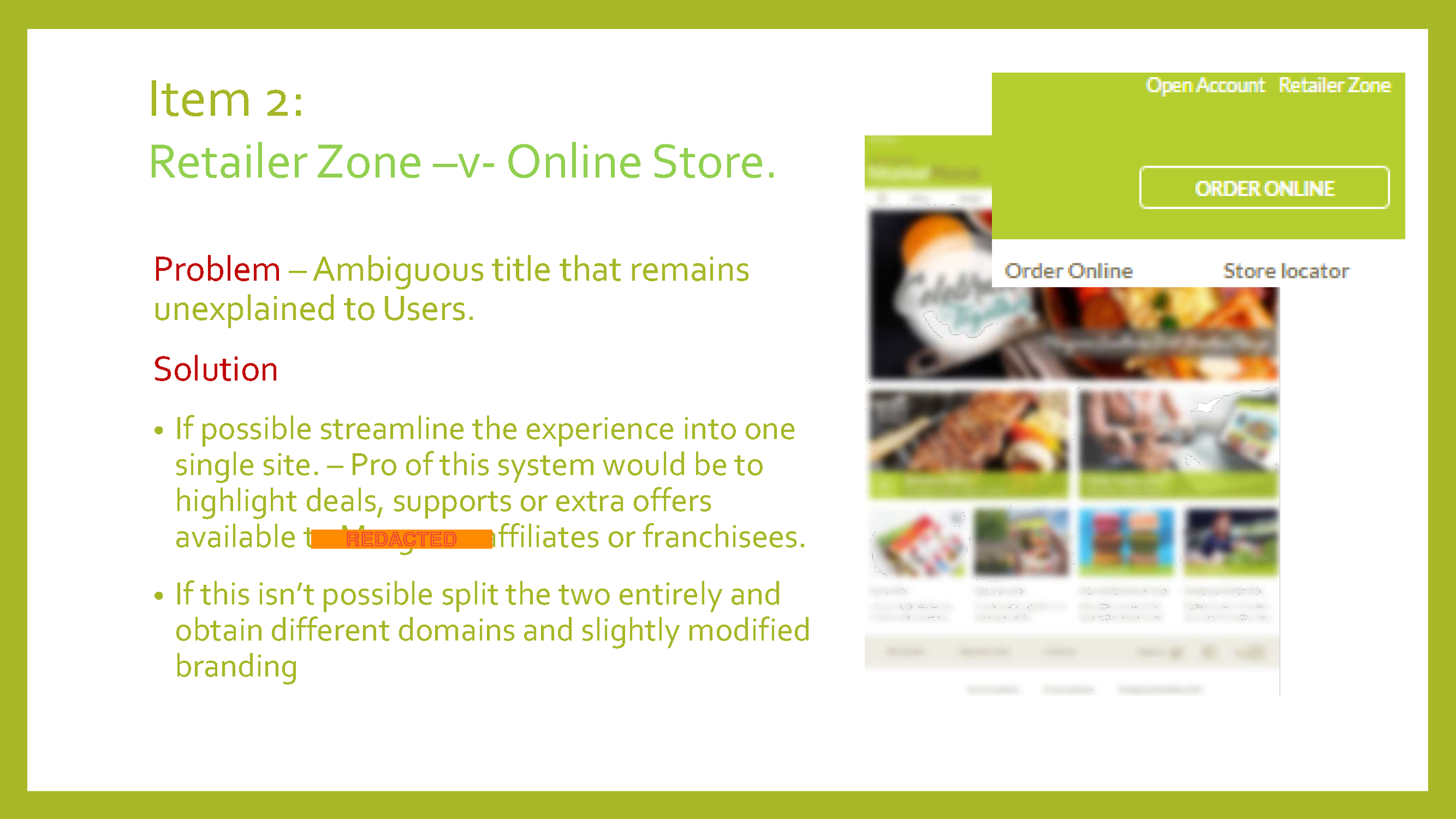
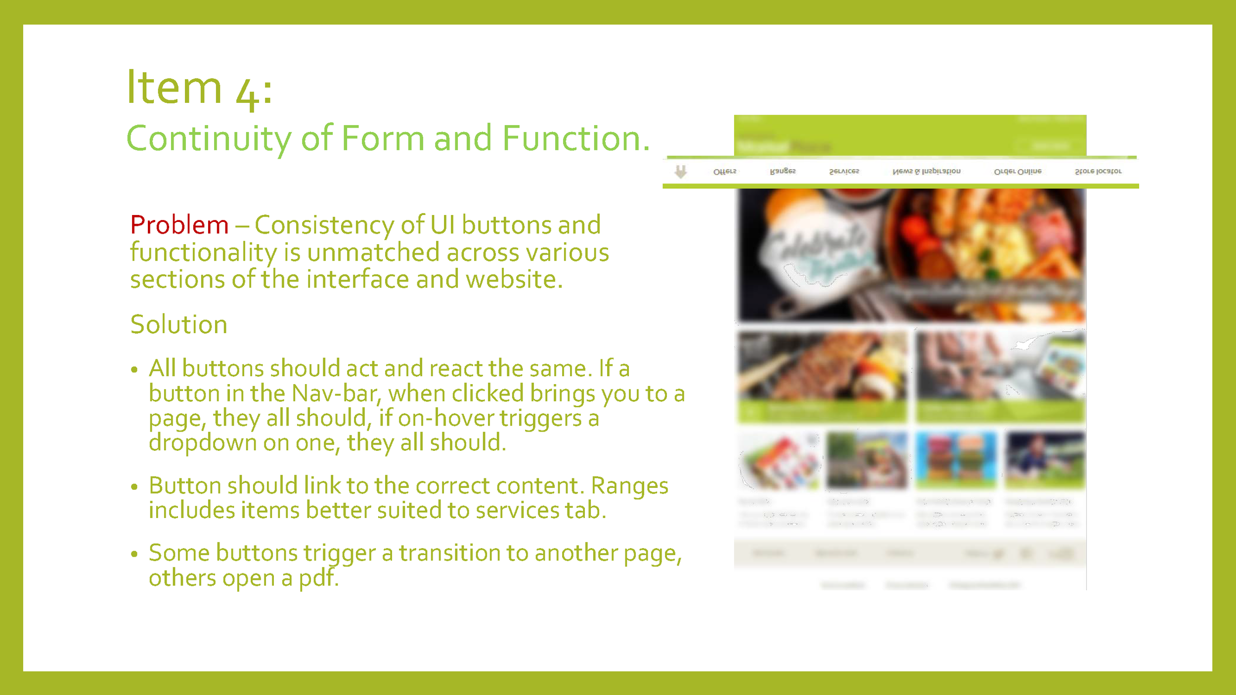
In recent weeks I returned to the site to see had anything changed. Some things had..... namely those things I had detailed in my suggestions. It was roughly done, with fixes obviously wedged in to the spaces that I had seriously flagged in my presentation. Other pieces were done in the spirit of what I had suggested but not with the actual execution that I had intended. For instance I suggested the use of descriptive tool tips in order to help guide new Users through the site. Tooltips were implemented, however these tooltips were essentially just rewording of the buttons over which they were hovering and therefore offered nothing more than just visual clutter to the page. The path to the Online Store was fixed, but was still obviously a rushed job, possibly completed even before I had reached home after my interview! The site still causes multiple different tabs and even browser instances to be opened as you navigate the page and there is still a reliance on the User downloading PDFs to view offers and catalogues.
However, as an e-commerce site, it now is accessible and usable. Route one was achieved. Just about!